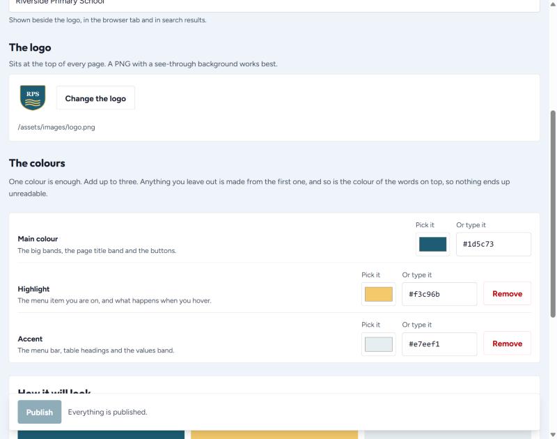
The name, the logo and the colours the whole site is built from. Most schools set this once and never touch it again.
The name
Shown beside the logo, in the browser tab and in search results.
The logo
Press Change the logo and choose a file. A PNG with a see-through background works best — a logo with a white box around it will show that box on every page.
The colours
| Colour | Where it is used |
|---|---|
| Main | The big bands, the page title band and the buttons. |
| Highlight | The menu item you are on, and what happens when you hover. |
| Accent | The menu bar, table headings and the values band. |
Anything you leave out is worked out from the first colour — and so is the colour of the words on top, so nothing ever ends up unreadable.
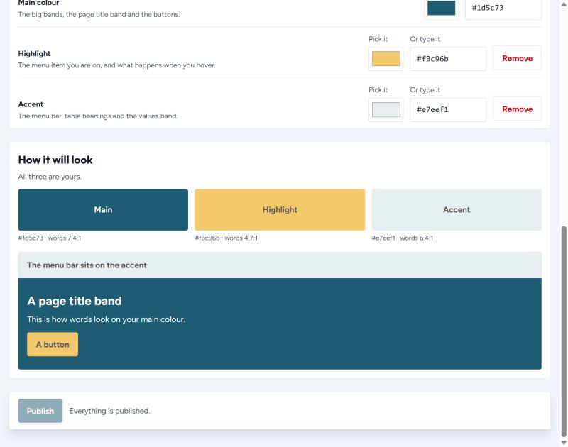
If a colour you pick would make the words hard to read, the screen tells you and explains what it will do instead. Trust it.